Love Came Down
Sweet music video – but simple enough for anyone to use the idea:
(from Brian Johnson – whole album here)
Hi, I'm Jeff. This is my personal blog – random thoughts on Media, the church, the arts, popular culture, being a husband and father and about any other thought that comes to mind.

Sweet music video – but simple enough for anyone to use the idea:
(from Brian Johnson – whole album here)

At the Verge 10 conference we were introduced to each main session by a very creative video featuring Alan Hirsch introducing the topic. Besides incredible content in the videos, I was impressed by how easy we can be trained to read from right to left, bottom to top, randomly, etc while watching the videos. And even more, how easy it is to catch pieces of words, fast moving word and silly phrases while we are exposed to the content in multiple media (video, text, sound, lighting) at the same time. How often do we limit ourselves based on what is normal for us when we could be more creative, produce pieces that would inspire, hold the audience attention and get the message across in a memorable way? How can you make your next video better?
[Sorry, the original video has been removed – I will update this when it becomes available again, but here is somebody’s cell phone version.]
(photo by Verge photography team)
Under the category of cool tools is a program I have used for planning and script writing, Celtx, has released an update to 2.0, and it is better than ever (www.celtx.com).
It has a lot going for it – it’s free, it’s cross platform (Windows, Linux, Mac OS) and it has a lot of flexibilty. Now they have added Celtx Studio, which is an online collaboration site for teams using Celtex – free beta, and after that fairly inexpensive.
So why use celtx? Honestly I did this pre-production for years in MS Word, but celtx does a great job of helping organize and format many pre-production task, making it easier to actually do it, and allowing you to produce professional looking scripts, storyboard layouts, schedules and reports.
This is a slick video using motion graphics to tell a “story”.
How well does it hold your attention?
How long before you start getting the feel / mood of the “story”
How far into the video before you start to “understand”?
Why is it that the better the camera you have, the harder you have to work for a good picture?
We have had several frustrating experiences lately trying to get a good picture. When I try to figure out why, it come down to a couple of fundamental issues and a question. In this case I have been dealing with a digital SLR camera, but the same applies to our video cameras, and possible many other gadgets and tools we use.
Issue one: Compromise
One of the big differences between a point and shoot consumer camera and a more professional SLR camera is to make a simple camera they have made compromises. Everything from the size of the image sensor to the glass used lower the final quality of the picture (even if it is the same mega-pixel count), but in turn, those compromises help hide the flaws of the photographer and setting.
Issue two: too many choices (& too little time)
The more choices given to us, the more settings we have to remember to check, figure out, set, tweak, adjust…. all taking much longer to try and get that shot. The point and shoot camera has a few minor changes that can be made, but you pretty much get what you get – and don’t worry about it.
So the question:
I still am wondering if there is something wrong with my camera. (it is a Canon Rebel XTi)
Even if I cheat the light meter, the pictures appear overly dark. Is this because I purchased the wrong lens? I went with the highly recommended (and high priced) Canon EFS 17-85mm IS USM lens – only to realize later that it is not a very fast lens (f/4-5.6). Most pictures are blurry unless a camera stand is used because of the long shutter speed. Seems to be a decent outdoor lens.
But put the camera on full auto and the pictures are dark, the color is often off and it wants to use the flash for everything! Then again, most point and shoot cameras also use the flash all the time… So is the darkness issue really just a dynamic range issue?
Maybe we need to slow down a little, take the time to really set up the camera for each experience, use a tripod if necessary, take a moment to fix the lighting – and keep that point and shoot camera close by for the times we need to shoot and run.
[this is part 1 of a 2 part article, please see “How much for a projector?“ for part 2,]
Why should we use projectors in Worship?
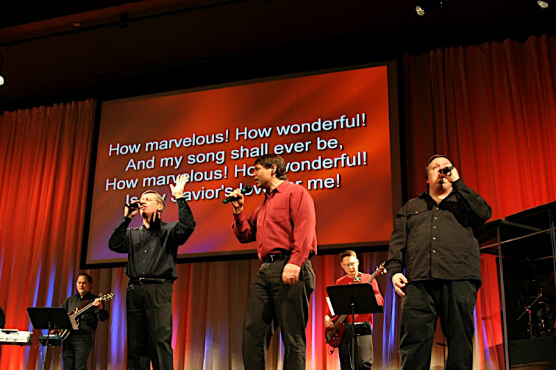
Projectors are only a tool to allow a larger crowd of people to view text, a computer image or even video. A small screen like an iPod is great for personal viewing, a television might work for the entire family, but when 700 believers gather in one room, a projector and screen are the most practical way to share visual media. The projected image is a focal point, a visual stimuli, a reinforcement tool for memorization, and a distance breaker in larger assemblies.

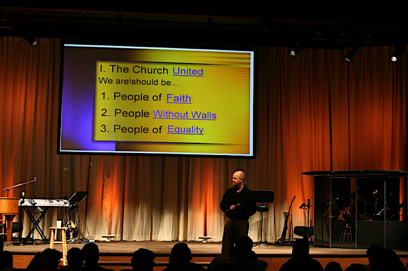
Words on a large screen at the front of the room will focus attention in one direction, praising and worshiping together. Printed song-sheets cause individuals to sing downward, focused on the page in front of them. With a screen up front, all are on the same page, instead of flipping pages in a song book. Projection is also fabulous for displaying a Scripture for all to read as one. By projecting sermon notes, points can be revealed one at at time keeping each listener focused on what is being said and eliminating the distraction of the entire sermon outline in a bulletin insert.

Having created a focal point, projection can then deliver images, colors and textures that help steer corporate worship, creating an atmosphere that brings all the senses to attention to worship in unity. Not unlike stained glass windows and frescos in cathedrals of old, projected images can inspire us to worship God together for who He is and for what He’s done and created. Images can be used to capture the heart and bring conviction and call the viewer to action. Finally- one potential distraction to corporate worship are announcements and testimonies that become so wordy as to lose attention: having these prerecorded and shared via projection can be much more effective at keeping the worship atmosphere through the benediction.

Reinforcement of ideas through stories and illustrations is a technique that goes back to prophets of old. Repetition of important points works, and is even better when a theme is repeated. We see this in Scripture, and we see it in today’s media culture. When various media work to communicate the same message, the message becomes memorable, easier to understand. Seeing the same logo on banners, on the screen and on the printed bulletin, all while hearing the message, increases retention of the topic and the text. For example, a busy, overwhelmed mom sits through one worship service that uses limited media, and realizes by dinnertime Sunday that she cannot remember the text of the sermon. Another day, she comes across a sermon on the Internet where the preacher has visual aids- in the form of projecting a graphic that matches a stage prop and the print on the virtual “bulletin” (which had been the bulletin given out at that church’s Sunday Morning service). The complete saturation into her consciousness through not only auditory memory but also visual memory means that six months later, the sermon is remembered- not only the topic, but details of the teaching.
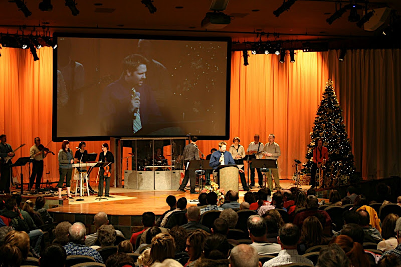
 Projection is the means to share a message with a larger audience. Communication is largely unspoken communication such as gestures and facial expressions. Image Magnification (IMAG) allows the large congregation see the details of the pastors’ and speakers’ communication, and improving the transfer of the message. Likewise, cameras can be turned to the audience improving the preacher’s view of his listeners. This enables him to become even more effective, responding to the feedback he’s receiving. Without projection in a large assembly, some may feel they are on the fringe. Projection draws everyone nearer, facilitating intimacy in even a large gathering.

Video should be a support tool used in our corporate worship. As with the room itself, air-conditioning, lighting: it can be taken for granted as it helps a group of believers worship as a single body, helps deliver the message, helps set the mood and atmosphere. Video helps engage more of our senses and focus our mind on what we are hearing and experiencing. Video can help make a larger gathering more intimate, allowing those all around the room see and experience the same thing as those up close to the platform. Video is a communication tool that can be used to help convey the preaching, help inform the congregation of news, events and needs, help share personal testimonies and encourage and build up the body. Projection is the tool that makes this possible.
With the failure of the primary video projector during service this week, now is a good time to re-examine the practical aspects of how to choose a projector.
Why do we need such an expense as a projector?
When choosing an appropriate projection system one must consider the needs to be met and choose the components to satisfy those requirements. Light, room and screen size, and resolution are the variables to be considered.
The lighting conditions in the space will determine how bright the projection image must be to be seen clearly and with proper colors and definition. Just as the light from the projector reflects off the screen so one can see an image, the light in the room also is reflecting off the screen (usually WHITE light), competing in brightness with the image. Add to this a fundamental problem with projection – with dark areas of the video or image, you are trying to make a WHITE screen surface appear BLACK! Luckily, eyes have a limited range of sense from the brightest area of an image to the darkest area, so all we have to do is make what is suppose to be white or bright much brighter than the areas that are suppose to be dark or black. How bright of a projector that is required to do this depends on how much room light is reflecting off the screen causing the darker areas to be light. A movie theater is relatively dark, so it doesn’t take a real powerful projector to make the bright areas much brighter than the dark areas. A sanctuary and platform with lots of bright lights, however, requires a bright powerful projector to produce an image.
The size of the screen also determines how big a projector is needed. A finite amount of light comes out of the lens of the projector (measured in Lumens) and begins to spread. The farther the screen from the projector, the more the light has spread out and the larger the image. The problem is that finite amount of light is spread out over a larger and larger surface area, thus the amount of light reflecting back from any one area of the image is less and less. This is why a larger screen requires a more powerful projector than a small screen.
The viewing environment and use of the screen determines the size of the screen. A screen for a movie needs to be big enough to envelop the audience, to transport them into the movie and help them forget they are sitting in a theater with a couple hundred other people. A screen for a presentation needs to be large enough that the people sitting farthest from the screen can see and understand the images being shown. A screen for displaying lyrics and scriptures needs to be large enough that six to eight lines of text easily fit and can be read from the back of the room. Studies have shown that the optimal height of the screen should be 1/6th to 1/8th the distance to the last row of seats. For a sanctuary where the last row of seats is 120 feet away, this translates to a screen that is 15 to 20 feet tall. But don’t forget the front row, if the screen is too big they will not be able to view the entire screen from edge to edge, so the distance to the back row should be balanced with the distance to the front row, or more than one screen should be used, each covering different viewing areas. The width of the first row also effects the screen size and placement choices. As with many other things technical, tradeoffs need to be balanced in choosing the screen size.
How close the congregation is to the screen determines the need for resolution of the image. The closer people are to the screen, the more likely they will be able to see the individual pixels that make up the image. The larger the projected image is, the larger these pixel blocks are. Seeing individual pixels causes images and text to look jagged and grainy. With projection and other digital images there is also the “screen door” effect, where the black lines between individual pixels break up the image. When combined with motion video, this causes annoying artifacts for some, while other people are so sensitive to it as to feel motion sick – not the best atmosphere for worship. Those who study such things and set standards have determined the required resolution versus seating distances, based upon the human eye’s ability to discern the height of an image at a given distance. These standards can be applied to select the required resolution for the projection system.
Why won’t a consumer, portable projector work?
There are advertisements from the popular computer manufacturer or office supply house for inexpensive projectors that seem very bright. It is tempting to think that a thousand dollar projector will serve the congregation instead of spending tens of thousand dollars on a large venue projector, but that is seldom a satisfactory solution. There are some big differences between the consumer grade projector and the venue grade projector.
Large venue projectors can accept a wide range of lenses, so the proper lens can be chosen based upon the screen size and the best location to mount the projector. Portable projectors have a built in lens, which has a limited zoom range, limiting the distance from the screen these can be mounted. Because these projectors are often designed to be set up in conference rooms and class rooms front and center, the zoom range of the lens is designed to set the projector close to the screen – often impractical in a church sanctuary that holds more than 200 people (the typical size of a conference or class room).
Larger projectors are often designed for quiet and continuous operation, while portable projectors of often designed to be small and light weight. The consumer, portable projector uses noisy cooling fans to move a lot of air to keep them cool enough for short term use, but may overheat easier during long periods of operation.
Large venue projectors start at 4000 – 5000 lumens and are available up to 30,000 lumens plus, where as portable projectors typically are only available up to 3000 – 5000 lumens of brightness. As we have seen above, sanctuaries and worship centers often require much brighter projectors than a home theater or conference room, with the typical large screen requiring 10,000 to 12,000 lumens, much brighter than most portable projectors can provide.
There are many other specifications and room design factors that can help determine the right projector for the job, beyond the scope of this article, but the intent here is to give an overview of projection and the practical aspects of implementing it in a house of worship. For more information about projection systems, contact a church media consultant such as myself (jeff@essentricaudio.com) or let me suggest a design build firm such as Stark Raving Solution and let us design the right projection system.
Every opportunity to edit a video presents choices. The outcome of those choices makes the art. Like other art forms, every work is different and requires different treatment. As I have become more aware of these different treatments, I have begun to watch movies paying close attention to the editing, trying to understand how the edit effects the movie’s story, feel, emotional impact and even how involved the audience becomes. I then take these lessons into the edit on my projects, applying them carefully to each project.
Sometimes I have taken criticism on some of these works specifically due to the editing style, so I was pleased to read this article about cutting the Bourne Ultimatum. Christopher Rouse has been praised by many for his editing, especially previous to this latest Bourne film, but there are many who are criticizing his editing on this film. Most of the complaints are about it being too fast or too jumpy or even too edgy. As I read this interview, I felt refreshed by Rouse’s attitude towards the criticism and his desire to edit each project in a way that fits the directors style and what the director is trying to accomplish. I realize there is more to the overall style than just the editing – the directing, camera work, lighting, sets – they all play an important role in developing the story. And each of these (including the editing) is as much art as it is science or technical ability. Every piece of art has its critics and its admirers. If we try to understand the artist and what the artist is trying to accomplish, often we move from being a critic to appreciating the art if not admiring the work.